Monday, 28 March 2011
Final article page
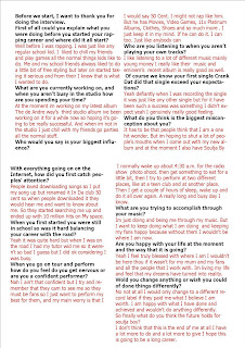
This is my final article page. For this page i was incorporated the layout from Vibe magazine but with my own twist because Vibe only uses one image but im using three. Two of them i wanted to look as if it were a photo shoot and the other as my artist in a normal surrounding. My colour scheme is red and black so remembered that as i was creating this page, i put the questions in bold black writing and the answers in bright red font. In Vibe they used a few quotes from the interview to stand out making the article more intriguing. For the title "Exclusive Soulja Boy" i did on Publisher because i was going to use dafont but wanted to do some effects with it.
Friday, 25 March 2011
Final contents page
All these pictures are original. I used the template of NME's contents page and added my own images and
articles. I used the main image in the middle larger than all the others because it is the main feature (the interview iwth soulja boy). I choose to use more pictures than writing because i want my target audience the younger generation i do not want them to be put off by there being a lot of writing.
I also wanted to use bright colours (red) to catch peoples eyes, but also because i wanted to keep to my colour scheme.
The top one is my final because i deleted the advertisment and put another column of text.
Draft of my front cover
This is just a rough drawing of how i want my actual front cover to look like. I took inspiration form Vibe magazine because of the genre and the fact that like it because it is simple but effective. In my final one i plan to put more cover lines and add some bright colours to catch peoples attention.
Friday, 18 March 2011
Draft for my contents page
The first image above is a outline of how i want my layout of magaizne to be. I have used the same layout as NME music magazine(The image just above) because i like the use of all the images and the fact that there is'nt to much text to read. I think that they layout i have used is simple but eye catching and once all the images are put in it will look like a proper contents page.
Monday, 7 March 2011
Subscribe to:
Comments (Atom)


